A new flavor of Google Trends
The latest version of Google Trends is now live! If you've used it in the past, you know that Google Trends can be used to see how popular certain search terms are across geographic regions, cities, and languages. With our latest update, you can now see numbers on the graph download to a spreadsheet. (Note: Both these functions are available after you've signed in to your Google Account.)
Let's walk through an example of how these nifty new features come into play. With the hot summer months rapidly approaching in many parts of the world, many of us turn to the frosty treat of ice cream to cool off. But have you ever wondered which flavor people search for more frequently: vanilla or chocolate?
First, let's take a look at the searches for vanilla ice cream and chocolate ice cream separately. Here's what vanilla looks like on its own:
You'll notice a number at the top of the graph as well as on the y-axis of the graph itself. These numbers don't refer to exact search-volume figures. Instead, in the same way that a map might “scale” to a certain size, Google Trends scales the first term you've entered so that its average search volume is 1.00 in the chosen time period. So in the example above, 1.00 is the average search volume of vanilla ice cream from 2004 to present. We can then see a spike in mid-2006 which crosses the 3.00 line, indicating that search traffic is approximately 3 times the average for all years. Read more about how we scale the data.
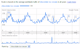
Here's what chocolate looks like on its own:
Let's look at how vanilla compares with chocolate. Keep in mind that when you compare multiple terms, they'll all be scaled relative to the first term you've entered.
As the numbers on the top of the graph indicate, vanilla ice cream has about 30 percent less search traffic than chocolate ice cream (and it's no surprise that both flavors are more popular during the summer months!) You can also see that the data has been ranked by vanilla, because it was the first search term we entered. However, you can use the drop-down menu beneath the graph to change the ranking to chocolate instead.
Google Trends is not only a fun tool; it also offers some practical uses as well. Suppose you own an ice cream shop and don't know which flavors to serve, or suppose you're responsible for stocking supermarkets across the country; Trends can help you explore the popularity and seasonality of your products. To conduct your own, more detailed analyses, you can now easily export Trends data to a .csv file (a common format to import/export data), which can be opened in most spreadsheet applications. When you use the export function, you'll also have the choice of using either relative scaling (what we've shown here) or fixed scaling (scaled to a specific time range).
We hope you enjoy this new flavor of Google Trends. And of course, we want to know: which flavor of ice cream do you like best?


0 nhận xét:
Đăng nhận xét